Skip to content

Winter Color Palette: How to Style in Winters 2026
- by Chic Ophicial
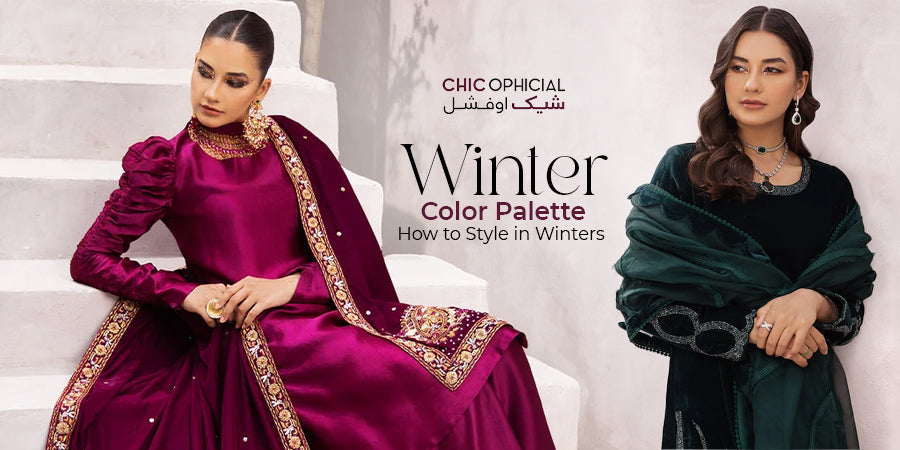
Winter dressing in Pakistan has a predictable problem. You pull out the same black shawl, the same maroon suit, the same safe navy, and every photo from every wedding starts to look identical. The fix isn't buying more clothes. It's understanding how a winter color palette works, which shades suit your skin, and how to pair them for everything from a chai run to a valima. This guide covers all of it for winter 2027.
Why Your Winter Color Palette Matters More Than You Think
Colors that work in June often fall flat in December. Winter light is lower, softer, and cooler, so pale lawn shades that glow in summer can look washed out against foggy mornings and grey skies. Heavier fabrics also handle light differently. Velvet deepens a shade, while silk and shisha silk make it shimmer. Most winter events happen indoors under warm marquee bulbs and candlelit tables, so the same outfit can read three different ways in one day. A deliberate winter color palette saves you money and second-guessing because you buy fewer pieces that work across more occasions. Start with how winter changes color, then build from there.
Light Changes Everything in Winter
Daylight in December is weaker and bluer, and that flattens soft tones even further. Dusty pastels can turn grey outdoors, while saturated jewel tones hold their depth. Indoors, yellow-toned event lighting warms everything up. Cool blues look richer under it, and orange-leaning shades can tip into brassy.
Fabric Changes How Color Reads
The shade on a swatch is not always the shade you'll wear. Velvet absorbs light, so emerald velvet reads darker and plusher than emerald chiffon. Khaddar and karandi have a matte, textured surface that softens color, while organza and silk add sheen. When you shop online, check the fabric before you judge the color.
The Winter Color Palette for 2027: Shades Worth Your Wardrobe Space
The 2027 winter palette isn't built around one hero color. It rests on four families that work together: deep jewel tones, rich earth tones, warm neutrals, and statement reds. Recent luxury pret and festive edits point in a clear direction with pairings like cocoa and vanilla, terracotta and olive, noir and rouge, and sage and pearl beige. These shades photograph well, flatter a wide range of South Asian skin tones, and pair easily with gold embroidery. They also suit both Eastern silhouettes and Western-inspired cuts like capes, wide-leg pants, and co-ords. Treat the families below as your shortlist. Pick two or three that suit you and ignore the rest.
Deep Jewel Tones
Jewel tones are the backbone of any winter wardrobe in Pakistan. They hold their color in low light, look expensive in velvet, and carry heavy embroidery without competing with it. If you only invest in one color family this season, make it this one.
‣ Emerald and Bottle Green
Emerald is the most forgiving jewel tone, and it flatters warm, cool, and neutral skin. Pair it with antique gold for weddings or ivory for a softer daytime look.
‣ Sapphire, Navy, and Ink Blue
Navy and ink blue are the smart alternative to black. They look polished at dinner and rich under event lighting, and they pair cleanly with silver, pearl, or blush accents.
‣ Plum, Orchid, and Electric Violet
Purples are having a strong moment, from soft lilac to deep orchid and electric violet. Go darker for evening. Keep lilac for daytime gatherings, where it reads fresh against winter grey.
Rich Earth Tones
Earth tones are the quiet luxury side of the winter color palette. They feel warm without being loud, and they work as well in a casual khaddar suit as in an embroidered pret piece. They're also easier to repeat, since nobody remembers a cocoa outfit the way they remember hot pink.
‣ Cocoa and Chocolate Brown
Brown has replaced beige as the go-to rich neutral. Cocoa paired with vanilla or cream gives you a tonal look that's understated but clearly expensive.
‣ Terracotta and Rust
Terracotta and rust bring warmth to skin that looks pale in winter. Balance them with olive, cream, or deep teal so the look stays grounded.
‣ Olive and Sage
Olive works as a dark neutral, while sage reads soft and modern. Both pair well with pearl detailing, gold, and earthy accent colors.
Warm Neutrals and Winter Whites
Winter whites and warm neutrals give your darker pieces room to breathe. Use ivory, vanilla, beige, and slate grey as your layering shades for shawls, dupattas, trousers, and coats. They also make jewel tones and reds look sharper by contrast.
‣ Ivory, Vanilla, and Beige
Choose warm ivory over stark white in winter, because bright white can look harsh in grey daylight. Beige and pearl tones work best with tonal embroidery or soft metallics.
‣ Slate Grey and Charcoal
Grey is underrated in Pakistani winter dressing. Slate grey with maroon or blush gives you a modern contrast that still feels refined.
The Statement Reds
No Pakistani winter wardrobe is complete without red. Wedding season runs on it, and the right red can work from mehndi to valima depending on its depth and fabric. Choose your red based on your skin and the event.
‣ Maroon and Oxblood
Maroon is the safest formal red. It's rich, flattering, and easy to accessorize with gold, and in velvet it's practically a winter uniform.
‣ Noir and Rouge
Black and true red together are bold and deliberate. Keep the silhouette clean and let the color contrast do the talking.
How to Find Your Shades: Undertone First, Trend Second
Trends tell you what's in stores. Your undertone tells you what will actually look good on you. Most people get this backwards: they buy the season's hero color and then wonder why it makes them look tired in photos. To check your undertone, look at the veins on your inner wrist in natural light. Greenish veins suggest warm undertones, bluish or purple veins suggest cool, and a mix suggests neutral. For a second test, hold gold and silver near your face; the metal that makes your skin look brighter usually points the right way. Once you know your undertone, your choices narrow down fast.
Warm Undertones
Warm undertones glow in earth tones and warm jewel shades. Reach for cocoa, terracotta, rust, olive, mustard, emerald, and warm maroon. Pair them with gold metals and ivory rather than stark white.
Cool Undertones
Cool undertones shine in blue-based shades. Navy, sapphire, plum, berry, cherry red, slate grey, and true black are your strongest options. Silver, pearl, and icy pastels like dusty blue finish the look cleanly.
Neutral Undertones
Neutral undertones can wear most of the palette, which is both an advantage and a trap. You'll look good in nearly everything, so the risk is a wardrobe with no direction. Pick a lead family, either jewel or earth, and build around it.
Winter Color Pairings That Actually Work
Knowing your colors is half the job. The other half is putting them together so the outfit feels neither busy nor flat. The pairings below are ranked from easiest to hardest to pull off. One rule helps across all of them: let one color take about 60 percent of the outfit, a second take 30 percent, and save the last 10 percent for an accent through embroidery, jewelry, or your shawl. Pakistani outfits make this easier than most, since the shirt, trousers, and dupatta give you three natural zones to work with. If you're short on time, start with Option 1 and skip the rest.
|
Base Color |
Pair With |
Accent |
Best For |
|---|---|---|---|
|
Cocoa |
Vanilla / cream |
Antique gold |
Dinners, luxury pret |
|
Emerald |
Ivory |
Gold or pearl |
Weddings, Eid |
|
Navy |
Blush or pearl beige |
Silver |
Evening events |
|
Terracotta |
Olive |
Gold |
Casual, daytime gatherings |
|
Maroon |
Slate grey |
Gold |
Formal dinners, baraat |
|
Plum / orchid |
Cream |
Silver or pearl |
Mehndi, festive evenings |
|
Noir |
Rouge |
Minimal metallic |
Parties, receptions |
Option 1: Tonal Dressing
Tonal dressing means wearing different shades of the same color, such as a cocoa shirt, chocolate trousers, and a beige dupatta. It's the fastest way to look polished, and it lengthens your silhouette. Texture keeps it interesting, so mix velvet with silk or matte with sheen.
Option 2: One Jewel Tone Plus a Neutral
Pair one jewel tone with a warm neutral: emerald with ivory, navy with pearl beige, or plum with cream. The neutral calms the jewel tone and lets the embroidery stand out. This works for almost every occasion and every undertone.
Option 3: Two Earth Tones
Two earth tones side by side feel rich and grounded. Terracotta with olive, cocoa with sage, and rust with mustard all work because they share warm bases. Add gold jewelry and you're done.
Option 4: Controlled Contrast
Contrast pairings are the most striking and the easiest to get wrong. Noir with rouge, maroon with slate grey, or navy with blush need clean silhouettes and minimal print. Keep one piece solid so the contrast looks intentional rather than chaotic.
Styling Your Winter Color Palette by Occasion
A Pakistani winter calendar is packed with office days, family dinners, dholkis, mehndis, baraats, and often an early Eid. Each setting asks something different from your palette. Daytime and casual events suit softer neutrals and earth tones, while evening and formal events reward depth, shine, and saturation. The most common mistake is wearing your formal palette to casual settings or the reverse, which leaves you either overdressed or forgettable. Map your shades to your calendar instead. Here's how to break it down.
Everyday and Casual Winter Wear
For daily wear, choose shades that hide wear, layer easily, and repeat well, such as olive, navy, cocoa, slate grey, and mustard. Keep prints small and embroidery minimal so pieces mix across the week. The Casual and Everyday Wear edits are a practical place to find these workhorse pieces.
‣ Let the Shawl Do the Work
One good shawl in a contrasting shade can carry five different outfits. A rust shawl over olive, navy, or cocoa changes the whole look in seconds.
Luxury Pret for Dinners and Gatherings
Dinners, dawats, and smaller gatherings sit in the middle: dressier than daily wear, lighter than a wedding. This is where sage, pearl beige, dusty blue, cocoa, and deep orchid shine, often with capes, wide-leg pants, or statement sleeves. Browse Luxury Pret for ready-to-wear options, or the full Women Collection to compare across categories.
Velvet for Evening and Formal Events
Winter evening events are velvet's territory, and color matters more here than anywhere else. Velvet deepens every shade, so emerald, maroon, navy, magenta, and rust look their richest in it. Explore the Velvets collection and the Velveteen Luxury Fall Collection for pieces made for cold-weather glamour.
‣ Pick One Texture Hero
If your velvet is heavily embroidered, keep the dupatta in a matching-tone organza or chiffon. Two heavy textures competing at once looks bulky rather than luxe.
Wedding Season Dressing
Wedding season is where your winter color palette works hardest. You'll likely attend several functions over a few days, and wearing the same color family to all of them makes your photos look repetitive. Assign a different shade to each event and plan ahead with the Wedding Fiesta collection.
‣ Mehndi and Mayun
Go bright but warm with mustard, marigold, emerald, hot pink, or rust. These colors hold up under fairy lights and photograph with energy.
‣ Baraat and Nikkah
For baraat, deep and regal works best: maroon, wine, emerald, sapphire, or antique gold. For nikkah, soft ivory, blush, or pearl beige keeps you elegant without competing with the bride.
‣ Valima
Valima leans softer and more refined. Silver-grey, champagne, dusty blue, sage, and lilac look sophisticated under evening lighting.
Late-Winter Eid Looks
Eid ul Fitr is expected in early March 2027, so you'll likely be dressing as winter fades. That makes it a transition moment: keep the rich fabrics but lighten the palette with ivory, sage, lilac, or ink blue. The Elite Eid edit offers elevated formals for the family, while Cleopatra suits anyone who wants a stronger statement.
Coordinated Family Looks in Winter Colors
Coordinated family outfits are a big part of Pakistani winter celebrations, from weddings to Eid photos. Done well, they look intentional and polished. Done badly, they look like a uniform. The difference usually comes down to color strategy rather than matching fabrics stitch for stitch. Pick one palette for the family and let each person wear it in their own way. A mother in emerald velvet, a daughter in a lighter green, and a son in ivory with an emerald accent look coordinated without feeling forced.
Match the Palette, Not the Outfit
Twinning is easiest when mother and daughter share a color without necessarily sharing the exact silhouette. Tonal pairs like cocoa and vanilla, rose and blush, or navy and dusty blue feel modern and photograph beautifully. The Mother Daughter Collection and The Maison Duo are built for this.
Keep Kids in Practical Shades
Children spill, run, and sit on floors at every dawat. Mid-depth shades like teal, rust, navy, and plum hide marks far better than ivory or pale pink. Save the light colors for the adults and keep kids comfortable in soft linings.
Accessories That Complete Your Winter Palette
Accessories decide whether a winter outfit looks finished or flat. The right metal, shawl, and shoes can lift a simple suit into evening territory in minutes. The wrong ones can fight your palette and make an expensive outfit look cheap. The fix is to match your accessories to your color family, not just to the outfit. Warm palettes call for warm finishes, and cool palettes call for cool ones. When in doubt, wear pearls, which work with nearly every shade.
Gold, Silver, or Pearl
Gold flatters earth tones, warm jewel tones, and reds like maroon, emerald, cocoa, and rust. Silver and oxidized finishes suit navy, plum, slate grey, and black. Pearls bridge both and soften heavier looks.
Shawls, Footwear, and Bags
Your shawl is the biggest color decision after the outfit itself. Choose one that either matches tonally or adds a single accent shade, never a third competing color. Keep footwear and bags in nude, tan, black, or metallic so they support the outfit rather than distract from it.
Common Winter Color Mistakes to Avoid
Most winter styling problems come down to a few repeat mistakes. They're easy to make because they feel safe in the moment. They also show up most clearly in photos, which is how winter events are remembered. Catching them before you dress saves you regret later. None of them require new clothes to fix, only better choices with what you already own. Here are the three worth watching.
Defaulting to All-Black
Black feels safe, but a whole winter of black makes your looks feel flat. It absorbs light at indoor events and can make skin look tired in daylight. Swap in navy, charcoal, or deep plum for the same polish with more depth.
Ignoring Venue Lighting
An outfit chosen under bright store lights can look completely different under warm event bulbs. Check colors in both natural light and warm indoor light before committing. Oranges and yellows shift the most.
Chasing Trend Colors That Don't Suit You
A trending shade only works if it suits your undertone. If the season's hero color drains you, wear it away from your face in trousers, a bag, or embroidery accents. Keep your most flattering colors closest to your skin.
Build Your 2027 Winter Wardrobe Around the Right Colors
You don't need a new wardrobe to dress well this winter. You need a short list of shades that suit you, a few pairing rules, and pieces that work across occasions. Start with your undertone and pick two color families. Then fill the gaps with one everyday staple, one luxury pret piece, one velvet outfit for evening, and one standout look for weddings. Winter edits tend to drop in waves, so check New Arrivals as the season moves on. Browse the full range at Chic Ophicial and build around the shades that look most like you. Pick your palette before you shop.